Monday…Makeover Monday!! This post is about my submission for Makeover Monday 2020 week 5. I take this challenge as an opportunity to explore Tableau and hence most of my visualization for this series will be on Tableau. You can check my other Makeover Monday too and provide your feedback. This weeks’s challenge is about the survey among Great Britain Adults by YouGov about their preference for the next James Bond character.
The original survey and the article compares the opinion between those who love James Bond movies and the general population. However, for the challenge the context is changed from the original survey to comparison between Brexit voters: Remain vs Leave
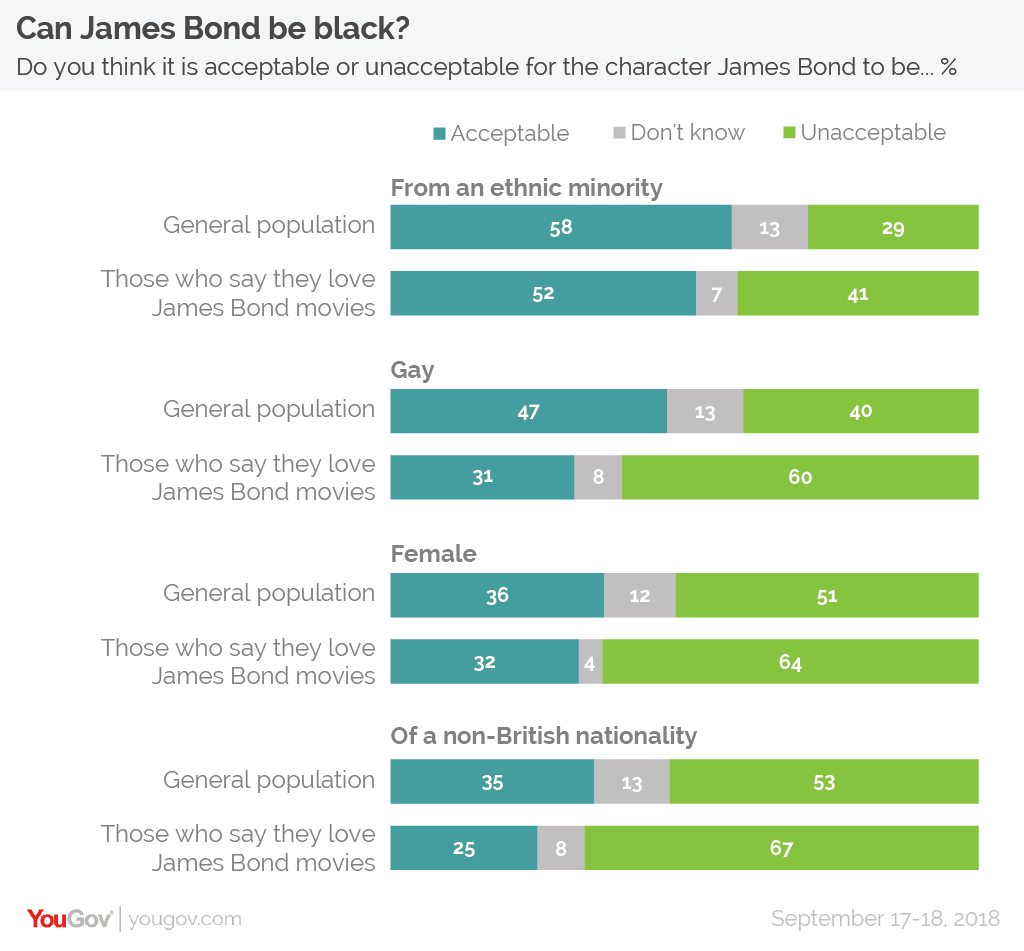
The sample data was provided by Makeover Monday Team. The original visualization present in the article is below

Analysis
What works with this chart?
The article highlights what is preference of the people of Great Britain with respect to next James Bond character. The chart correctly sorts the category in the descending order of acceptance.
What does not work with this chart?
The visualization could have avoided the unacceptable and Don’t know. The Don’t Know component is very small in most categories and Acceptable percentage will easily give readers an idea of the unacceptable percentage.
Makeover Monday Tableau
Data Points
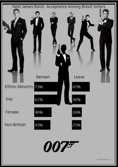
So in our case instead of general population we will compare Brexit Voters: Remain and Leave, only on Acceptable percentage to convey the message. We will basically keep only the enough information required to convey the message on what is acceptable to the survey participants.
Images Used
We used images to convey the context of the visualization rather than users having to read through.
Following are the image sources
- An article: Who will play the iconic character next?
- Hiclipart.com and pngguru.com
Final Output
Here is the final output. The live dashboard is available here: The Next James Bond


Leave a Reply